
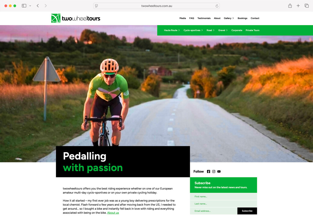
We build websites that work for your business.
Your website is your best employee – always available, incredibly user friendly, and intentionally converting visitors into leads.
Your website is more than just an online presence – it is a powerful tool for engaging with your customers, building trust and driving growth of your business. We are experts at crafting custom, user-focused websites that are packed full of wow, easy to use, and designed to convert.
We focus on intuitive design, with full responsive web design, and specialise in building websites that are bespoke for your business. We believe that your website needs to represent your unique business and the needs of your customers, and we love creating digital experiences that leave a lasting impact.
Web design that delivers both form and function
Responsive design
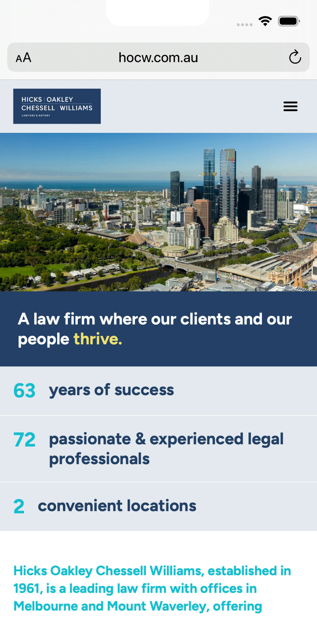
In a mobile-first world, your website must work seamlessly on any device, any time. Every site we build is fully response – at no extra cost! We rigorously test across various devices and screen sizes to ensure a flawless, finger-friendly experience.
Web design that converts
We make websites that get you results (and bring the wow factor too). Your website’s design, layout and structure all help guide visitors toward conversion, turning them in to valuable leads for your business.
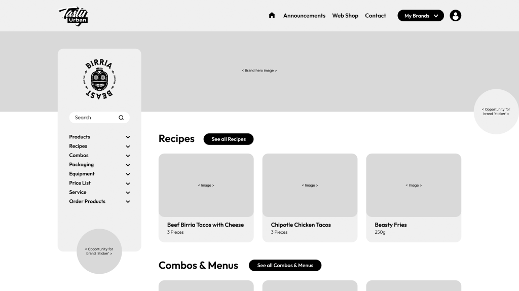
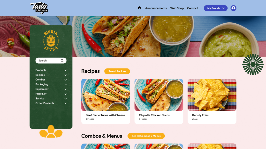
Custom designed
We custom design every website to best reflect your unique business and values. By taking the time to understand how your business works and the needs of your visitors, we craft tailored web designs that help you stand out online.
Functional UI and UX
Your website needs to be effortless to navigate, helping visitors find what they’re looking for with ease. It also needs to feel smooth, load fast and offer intuitive and user-focused interactions, helping build trust and reinforcing your business’s reputation.
Are you ready for a functional website that brings the wow?
Web design that wows


You need a fast website.
Your visitors are looking for something and your website has only milliseconds to deliver.
Performance is key to ensuring results. We build responsive websites that adapt seamlessly to any device – mobile, tablet or laptop – while intelligently serving optimised, next-gen images for a faster experience.
With near-instant response times, modern image formats and industry-leading technology, your fresh new website will perform for years to come. Every byte saved means better speed, and a smoother user experience.
Your website needs to impress both visitors and search engines.
We build websites that keep both happy.
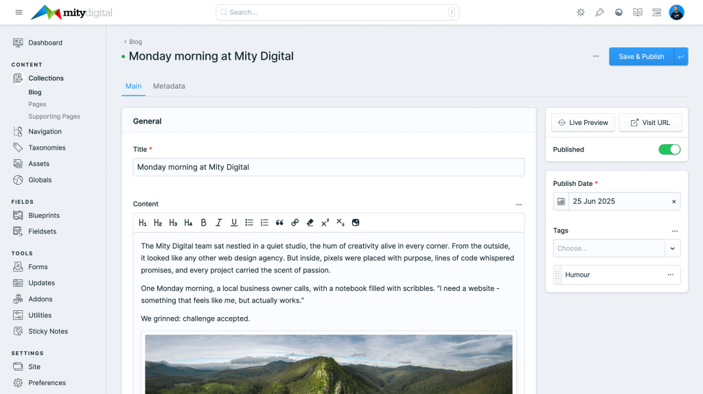
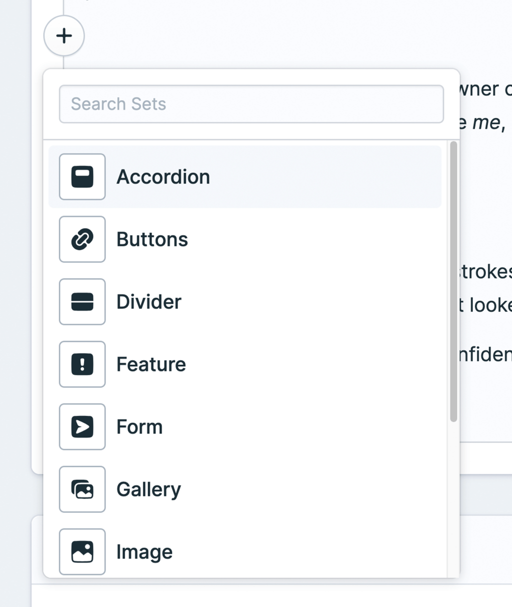
Keep your website up to date with author-first content management
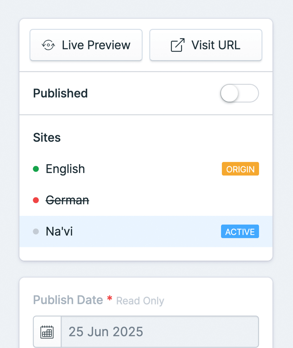
With Statamic, our content management system of choice, updating your website is easy. Funny name, and you may not have heard of it, but Statamic delivers a world-class content management experience for websites of all sizes.
We create an intuitive and well-organised authoring experience within Statamic – and it’s so easy to use, you won’t need a tech degree either. From creating or updating pages to uploading new images, Statamic will do the heavy lifting for you, allowing you to focus on the job at hand: keeping content up to date.
With author-focused features like Live Preview, you can see your changes evolve in real time, ensuring every update seamlessly fits within your site and its design.
Keeping your website current has never been this simple.
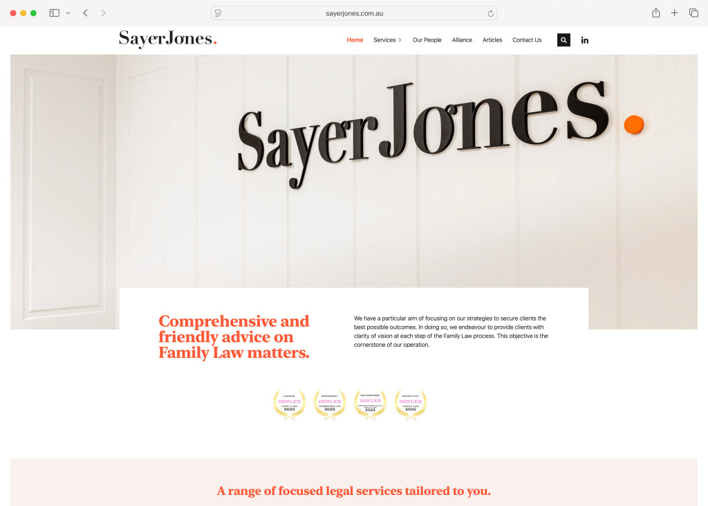
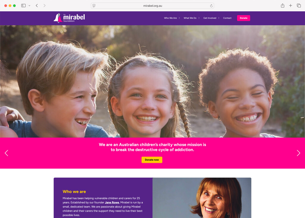
Expert Australian-based web designers
Your website is more than just an online presence – it is a powerful tool for engaging with your customers, building trust and driving growth of your business. We are experts at crafting custom, user-focused websites that are packed full of wow, easy to use, and designed to convert.
We focus on intuitive design, with full responsive web design, and specialise in building websites that are bespoke for your business. We believe that your website needs to represent your unique business and the needs of your customers, and we love creating digital experiences that leave a lasting impact.
We make websites to meet your needs
Like a snowflake, every website is unique, and we pick the right tech to help yours reach its goals.
Not sure what to expect?
Can’t find your answer here? Contact us and ask away.
The cost of a website depends on a range of factors, including the size of the site, the features you need. We’ll chat with you about your goals, create a tailored proposal, and provide transparent pricing up front. No hidden surprises, just great work, delivered properly.
Most websites take anywhere from 6 to 12 weeks, depending on the scope of the project and how quickly we can get yourcontent and feedback. We’ll work with you on a realistic timeline and keep things moving with a clear process and regular check-ins.
We specialise in custom design. We don’t use off-the-shelf templates; instead, we create a design that’s unique to you, your business, your content and your audience. Your website should reflect your brand - not look like a clone of someone else’s.
Absolutely. We build websites with content management in mind, so you’ll be able to easily update your content without needing to touch code with an incredibly user-friendly content management system. Whether you want to update text, upload new images or manage blog posts, we’ll make sure the editing experience is straightforward - and we provide you with personalised training too!
Yes: every site we build is fully responsive, meaning it adapts to different screen sizes and devices. From mobile phones to large desktop monitors, your site will look great and work smoothly everywhere.
We sure can. We can help crafting your content and also guide you with structure, tone and messaging to make sure your content works hard for your audience - and your business's goals.
While we’ve worked with platforms such as WordPress in the past, we now focus on more modern, flexible platforms like Statamic. It gives you a more intuitive and user-friendly editing experience, improved performance, and greater site design flexibility.
Absolutely. We prioritise performance in every website build - from clean, efficient code to web optimised images and blazing-fast caching.
As we build your website we follow the industry-standard best practices. Even your Statamic control panel account requires two factor authentication for that extra layer of security. We also offer business-grade web hosting to keep your site online, including fully private and managed servers, HTTPs and regular updates to both the server infrastructure and your website's software.
After launch, we’re here to support you. Whether that’s on-going updates, performance tuning, additional features or just a bit of guidance when you need it. We’re your long-term digital partner, not just a one-off supplier.
Our proven approach to web design
1. Strategy and planning
We take time to understand you, your customers and your goals, so that we can define a strategy to bring you results. Our years of experience help us create innovative and flexible plans that will bring you the wow.
2. Sitemap, structure and wireframes
Getting results requires planning, intelligent structure and a well-defined approach to your site’s design and the journey your visitors will take, We focus on your website’s UI and UX, highlighting key conversion points and calls to action.
3. Design
Your brand is a valuable asset – and building trust with your website visitors essential. We custom design your site to reflect your brand values, align with your strategy, and bring that wow to your business online.
4. Development
We develop our sites right here in Australia – and focus on reliability, responsive design and performance, all tailored to your project’s strategy. Your fast, optimised website will be loved by both visitors and search engines!
5. Launch and on-going support
Launching is such an exciting stage – but it is just the start. We pride ourselves on providing customer-focused on-going support to continue to work with you to evolve and grow your site.
Hear what our clients say

Tarnia Simpson Marketing Manager, HOCW Lawyers
We worked closely with Michael and the team at Mity Digital to rebrand and rebuild our firm’s website. What began as a daunting project, with a large volume of content and multiple decision makers, quickly became a smooth and manageable process thanks to their expert guidance and support.
From our refreshed logo and colour palette to their thoughtful suggestions on layout and imagery, every detail was carefully considered. No question was too small, and no request was ever too hard.
The result is a website that truly reflects who we are as a firm. The process was seamless, and we couldn’t have asked for a better team to work with.
We highly recommend Mity Digital to any business looking for a collaborative and strategic web partner.
Doug Spencer-Roy Corporate Affairs & Marketing Manager, EastLink
Mity Digital was of great assistance during the design phase, to help us create a truly device independent website with a cost-effective and easy-to-use Statamic content management system.
The content website is hosted by Mity Digital, and services up to 25,000 user sessions a day. We don’t receive complaints about the performance of the content website, and the hosting service has been impeccable.

Matt Betros GBA Projects
Mity Digital has enabled GBA Projects to develop efficiencies in the management of data on large scale construction projects. Scalable and flexible, Mity Digital's platform has enabled our Project Control and Information System to come to life and support projects in real time.
Mity Digital provides an exceptional, high quality, value for money service for website and web application development and enables success at the information level.
I'd recommend Mity Digital for any challenging project, from building a website to an integrated application.

Robert Bonifacio Business Coach
I have known Michael and Marty for over 10 years now. In that time they have assisted and guided me and my business through our website development and needs.
In addition the support and service they have provided has been impeccable.
There's no end to our talents...
Statamic web design
An easy-to-use yet incredibly flexible content management system? That's Statamic, and we're here for it.
Web development
We build reliable, scalable, and high-performance web applications with Laravel.
Online stores
With millions of shoppers online every hour, your business can sell 24 hours a day, 7 days a week.
Graphic design
From business cards and stationery to signage, brochures, and annual reports, we bring your brand to life.