The benefits of working with images in Statamic

Statamic is our favourite flat-file Laravel-driven CMS platform, and recommend it for our new projects. Its flexibility makes it a platform to grow a site of any shape or size, and offer a top-class authoring experience for both words and images.
But images are what we want to talk about today – and how Statamic helps benefit everyone, from the content authors and administrators through to your site’s visitors.
Easy uploading and management
Uploading and managing images can often be a sightly frustrating aspect for non-web people – and let’s face it, content authors may have basic computer skills but may not know the different between image formats, resolution, resizing and cropping.
Statamic’s file and image management gives us, the developer, the ability to create different asset ‘buckets’ (for lack of better word) to help authors more easily manage their assets – including uploading during the content authoring process.
This means that is possible to keep the ‘blog’ images separated from the ‘product’ images for a cleaner and easier-to-manage web-based file browser.
The content author’s focus is just that: content authoring. Statamic’s interface for content authoring keeps the focus on the content, images and files and gets tailored to each content’s needs.
But wait… if content authors are just uploading files that aren’t optimised for the web, isn’t that bad? In other content management platforms, yes… but Statamic has you covered, so keep reading.
Automated image optimisation for a fast website
When we build a layout for a Statamic site, we have access to a number of handy tools, and Statamic offers out-of-the-box support for Glide, an image manipulation library.
As a user of Statamic, what does this mean to you? Well, nothing, except knowing that your website will automatically tweak your images for the web. Remember, your focus is on content authoring, not making images “right” for the web.
As a developer of Statamic, what does this mean to you? It means that you can build site layouts that can reference the images that your content authors upload, but perform some processing to make them work best for your site and its layout.
This can mean:
resizing down for different devices – so that mobile devices get smaller images, and tablets/desktops get a larger image
cropping of images to different sizes and aspect ratios
resampling for hi-res displays – meaning hi-res support for crisp and clear images for Apple Retina displays, and standard support for non-Retina displays
support for next-gen image formats, including jpg and webp
adjusting ‘quality’ for different screen sizes to influence final file size
adding watermarks to images on-the-fly
That last one may be a new one: but thankfully the web has made great steps to supporting modern and next-gen image formats – and formats like webp, while not fully supported on all devices, can greatly reduce the file sizes of images, leading to a faster overall website. Maybe you’re using a tool like Google PageSpeed and keep seeing “Serve images in next gen formats” – Statamic’s support meets this requirement.
This means that content authors can upload a single image to Statamic, and the site’s layout views will create numerous versions of the image for:
different screen sizes (such as mobile phones, tablets, laptops and desktop computers)
different screen resolutions (standard displays, and hi-res Retina displays
fully compatible jpg images, but progressive enhancement with webp images too
serving on the web, including automated optimisations and compression
The result of this process is that regardless of your device, you’re getting images that are made for your browsing experience, and receive an optimal load time.
Let’s look at the image load size for the Mity home page as an example (at the time of writing):
On a desktop, webp requires 35% less data transfer, and mobile a 24% saving. This can vary based on the ‘quality’ configuration, but webp is offering a significant decrease in image file sizes without compromising the overall quality. We could even tweak mobile compression further to really squish more out of each image too - as with any image compression, it is a balance between quality and bytes.
You may think that sounds like a lot of image processing – and it is – but the Statamic team have thought of that too, and when an image gets rendered – resized, cropped, hi-res, low-res, jpg, webp, whatever – it can get saved to the server meaning the next time it is needed, it serves the pre-rendered version. And this in turn means one thing: your site remains fast.
And of course, if images get updated, the image cache can be cleared to re-render changed images. Yep, Statamic has all the under-the-hood tricks to make for an awesome developer, content author and visitor experience.
But here's the real kicker: the content author loads one image... and Statamic does all of this for us (based on how the site's layout is built, of course).
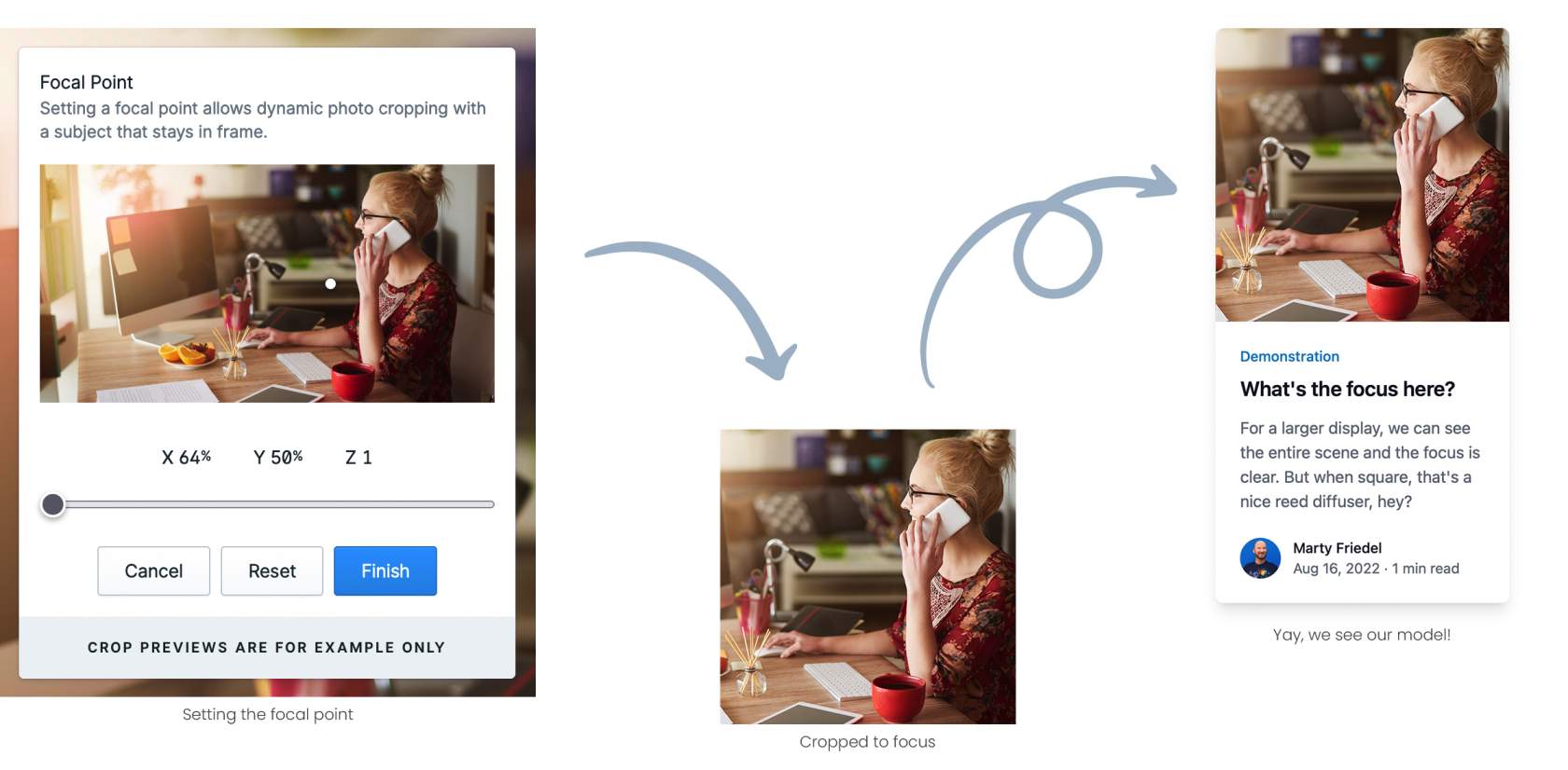
A focus point provides on-demand cropping
In case you missed it above, Statamic allows for on-demand cropping of images. If a content author uploads a rectangle image in a 3:2 aspect, Statamic can easily crop it to a 4:3 aspect for the right placement in the website.
This point really follows on from the previous section though. In a site’s layout, let’s say you have an index of blog posts. Your site may need:
a rectangular thumb for a desktop layout
a square thumb for small mobile devices
Of course cropping can simply cut off the edges of a rectangle to make it a square – but what if that cuts off the side of someone’s head? Or a logo? Or the key focus of the image gets lost?
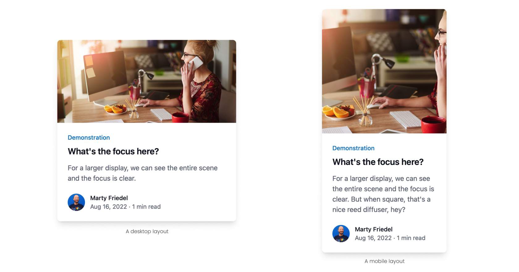
Statamic has you covered here too, with support for focus point cropping. This means that content authors can pick the focal point of the image, set a zoom level, and have Statamic then crop images to fit.
The best part of this is not just improved cropping to keep the focus in frame, but also adjusting the zoom to help improve the focal point for different crop aspects.
While this can be great for some use cases, there are others where cropping just isn’t an option. But Statamic still has this covered too with its flexible blueprints. In other words, the building blocks that make up all the components of your page.
For that theoretical blog post, you could even select two images: one that gets used for the rectangle presentation, and one for the square presentation. They could be the same image if cropping works for your rectangle image, but also gives the author flexibility to upload a custom-made pre-cropped square image to ensure the image shows everything it is meant to. As a developer, we can even add additional fields to fall back to the rectangle image if no square is provided too, meaning that it only needs to be used if it is actually needed. After all, we love improving the lives of our content authors.
Whether you’re using Statamic’s automated cropping or a more advanced content authoring approach, Statamic still delivers an image resizing and cropping experience like no other.
Mity are Australia’s first Certified Statamic Agency Partner, and love building websites small and large with Statamic and Laravel.
Our dev team are all over how to get the best out of Statamic’s under-the-hood image performance, as well as a great experience for content authors within Statamic, meaning your site will be a breeze to update and still remain relevant to your visitors, lightning fast, and optimised for any device.
If you’re needing a website that makes image management easy and web-friendly, drop us a like – we’d love to have a chat!

Marty Friedel
Marty has a background in Computer and Information Science, software development, web development, multimedia and web accessibility, and is Mity Digital’s resident nerd.
Outside of his programming work, Marty is a keen landscape photographer, and also teaches Les Mills group fitness classes.